R. D. Rajasekhar Spent Two Months Taking the Colour Out of Ghajini
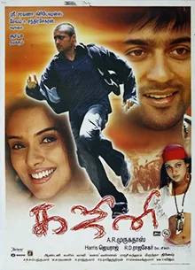
Nine years shooting advertisements, then a debut that made him the house eye of a certain kind of Tamil thriller. The washed-out look people remember from Kaakha Kaakha has a name and a chemical process behind it, and the award-winning one after it took two months of deciding what to remove.
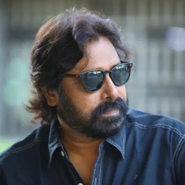
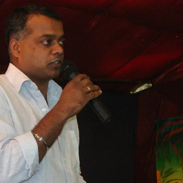
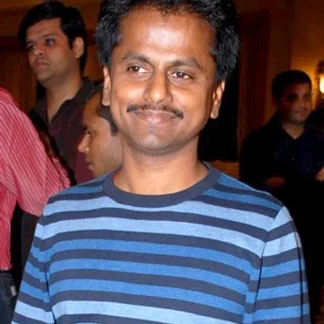
Photo: JUJU · CC BY 2.0 · source
Nine years of advertisements
Before R. D. Rajasekhar shot a feature he spent about nine years as an assistant cinematographer to Rajiv Menon, on advertising films. That is a long apprenticeship and an unusual one, and it shows in everything he did afterwards.
Advertising teaches a particular discipline: an image has to arrive complete in a few seconds, so the lighting decision and the grade have to be made before the shoot rather than salvaged after it. A cinematographer who learns the job that way tends to arrive on a feature with a look already chosen, and to defend it.
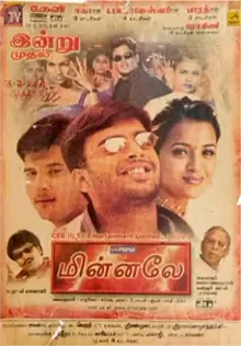
What got him hired was exactly that work. Gautham Vasudev Menon, a former colleague from the same world, was struck by his commercials, and gave him his first feature — Minnale, in 2001. It landed with young audiences, and the partnership stuck.

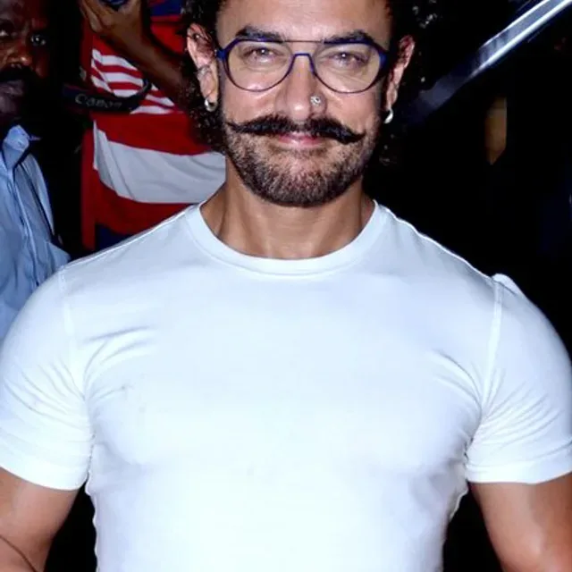
Photo: Epsajeevan · CC BY-SA 4.0 · source
What bleach bypass actually does
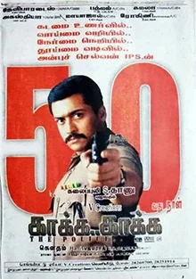
Their second film together, the 2003 crime thriller Kaakha Kaakha, is the one the look is remembered from. Menon wrote and directed it, Suriya and Jyothika played the leads, Harris Jayaraj scored it and Anthony cut it as his first film as editor. The accounts of Rajasekhar's work on it praise the visual style, and they name the technique: bleach bypass.
It is worth being concrete about what that is, because it is one of the few photochemical decisions a viewer can see without being told. In normal processing, the bleach step strips the developed silver out of the film and leaves only the dyes. Skip it — bypass the bleach — and the silver stays in alongside the colour. The result is a print with a black-and-white image sitting inside the colour one: contrast up, colour pulled down, blacks that go dense and highlights that go chalky. The washed-out quality people describe is not a filter or a mood. It is metal that was supposed to be removed and was not.